Miles & More - New Status Program
Miles & More has revised its status programme for 2024. This revision includes many simplifications for users and is intended to provide more transparency about the achievement of a status. To achieve this, all relevant content in the Miles & More app and on the website had to be revised. The focus of this revision was to convey transparency and bring the interaction up to modern standards without overloading the user with new content. In this project, I was responsible for the concept, UX and design of the new status area, as well as actively developing features and areas that contribute to the goal of the new status programme.
The challenge
The main challenge within this project was to prepare the complex and extensive data as simply as possible for the users. The clearly defined goal was to show users as simply as possible how far they had progressed in the status programme. In addition, the basic presentation of the status was different on different touchpoints, which was also to be harmonised in this project. In addition to the status area, some features were also modernised to explain even more clearly to users how the system works and the benefits for loyal customers.


The solution
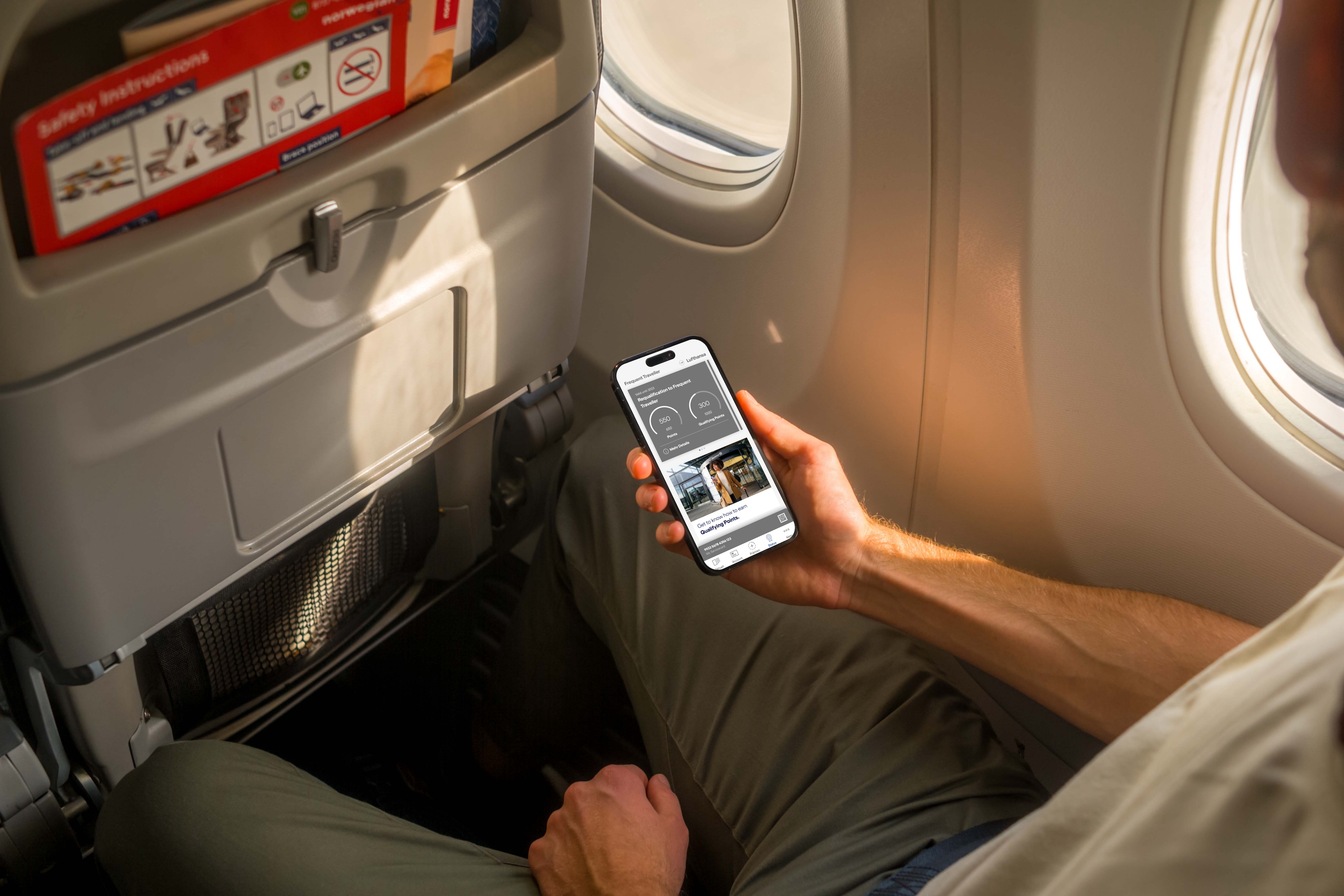
New programme from 2024
Lufthansa's loyalty programme has been around for many years and has long relied on a website and an app. Both had to be adapted in the course of updating the status programme. First of all, the changes to the programme can be clearly described with one goal in mind: Transparency. This transparency should make it easier for users to understand the programme and this should be reflected in the UX and design. Accordingly, all components that deal with the status were considered to check whether they fulfil the goal and describe progress accurately and simply.
There are basically four levels within the programme. These are
- Base -> The majority of users without frequent flyer status
- Frequent Traveller -> The first level of frequent flyer status held by most users
- Senator -> A Senator is the second level of frequent flyer status in the loyalty programme
- HON Circle Member -> This status is the non plus ultra in the programme and these users enjoy extensive benefits.
All three areas are directly interlinked and influence each other. I won't go into how the programme itself works in this case. Instead, you will find all the important information here.
Architecture & Structure
The architecture has not been fundamentally revised, but the structure has been completely rethought in part. The status area in the app and on the website remains in the same place so that users can still find their way around and know where to find relevant information. The structure of the status can be divided into three areas.
- Frequent flyer status
- Frequent flyer benefits
- Lifetime frequent flyer status
The frequent flyer status itself shows the user's progress within the programme and provides information on how long it is valid and which benefits apply.
In addition to the permanent benefits, there are also benefits that are unlocked as you progress. These differ from frequent flyer level to frequent flyer level. This progress must be clearly recognisable for all users.
The lifetime frequent flyer status, as the name suggests, describes a status that is valid for a lifetime. To achieve this status, the loyalty programme must be used for many years.

All touchpoints are important
An important focus within the project was to ensure that users perceive the same experience and find all relevant information regardless of the touchpoint. This was not ideally solved in the past and was significantly improved within this project. Both the layout and the communication were harmonised in terms of content and appearance. In addition to the dynamic data on the website and in the app, it was also important that the monthly newsletter always contains all current and user-related data. To make this possible, a new technical foundation was built, which was also expanded to include requirements from my design.

The right thing for everyone
Lufthansa's loyalty programme has many partners and several airlines are part of the system. The system must display the correct information for all users from the various airlines and the interfaces must adapt accordingly. Links, explanations, logos and so on must be displayed correctly for the entire bandwidth. This not only shows how complex the project is, but also how extensively it has to be tested and maintained. A project of this size and scope requires a lot of focus and a lot of time for testing.
